BeHealth
2024
- Copy Direction: Pedro Souza
- Strategy Direction: Amanda Perez
- Art Direction and Design: Júlia Cardoso
- 01Brand strategy
- 02Visual & verbal identity
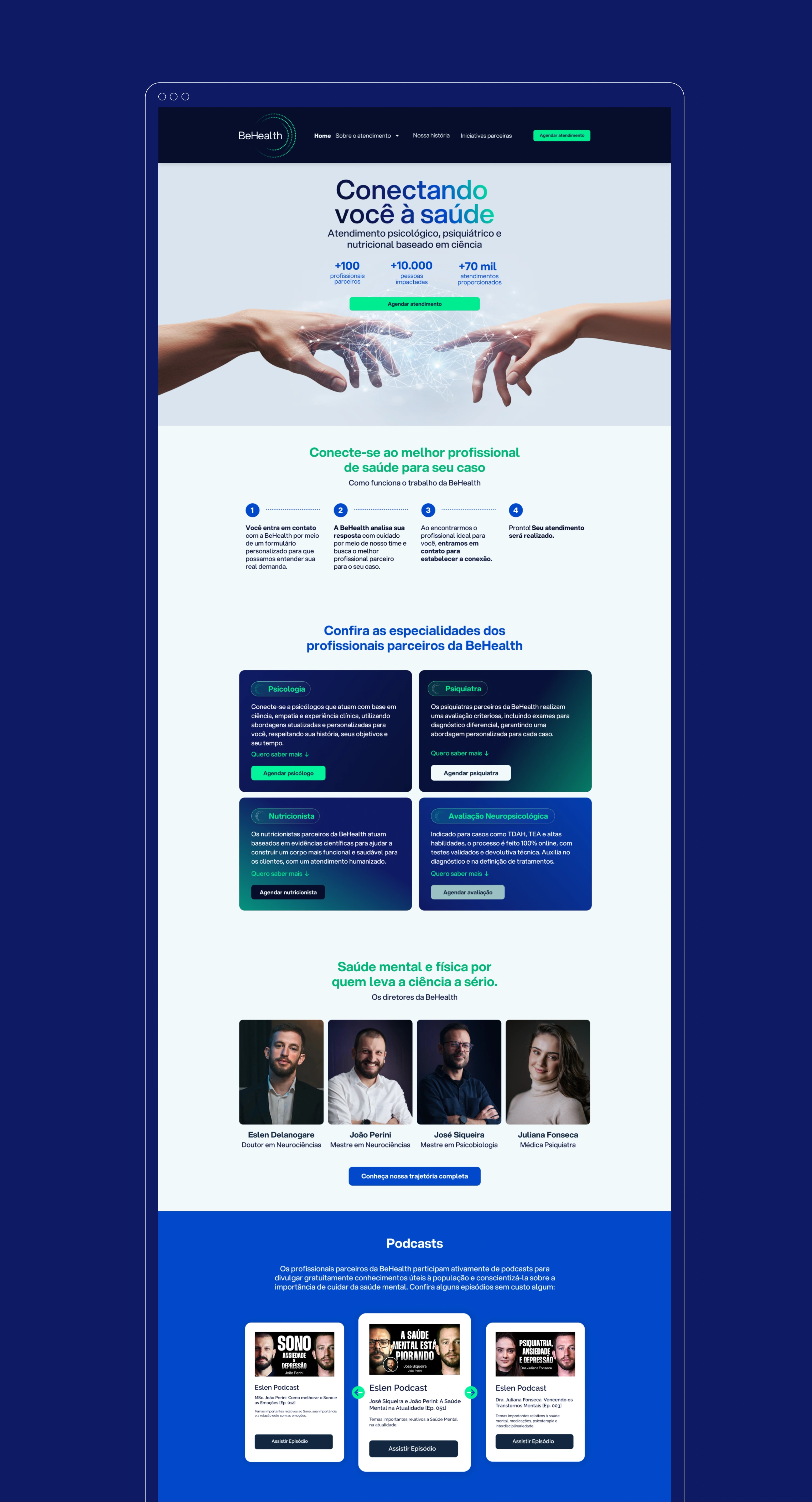
- 03Company website
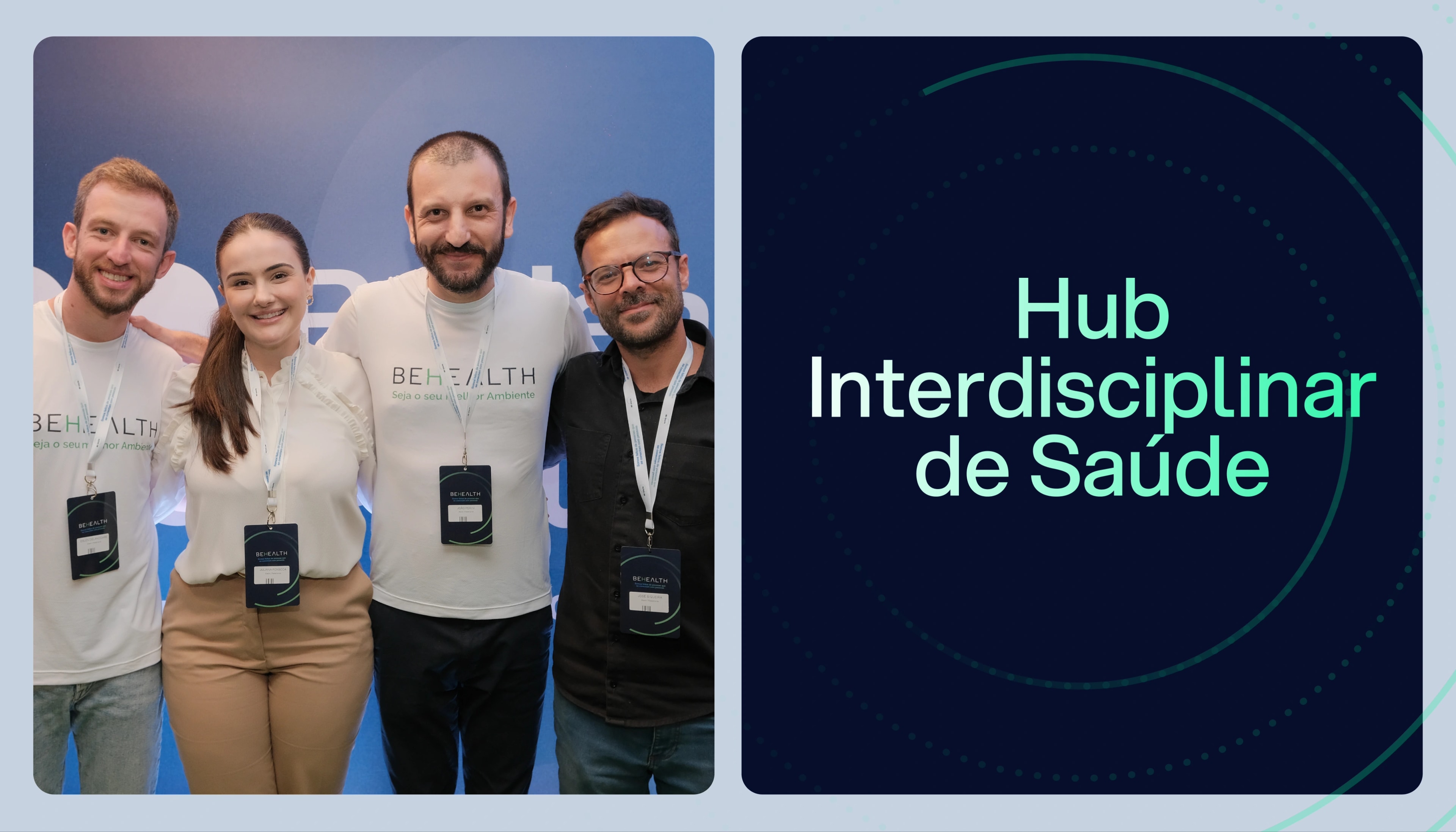
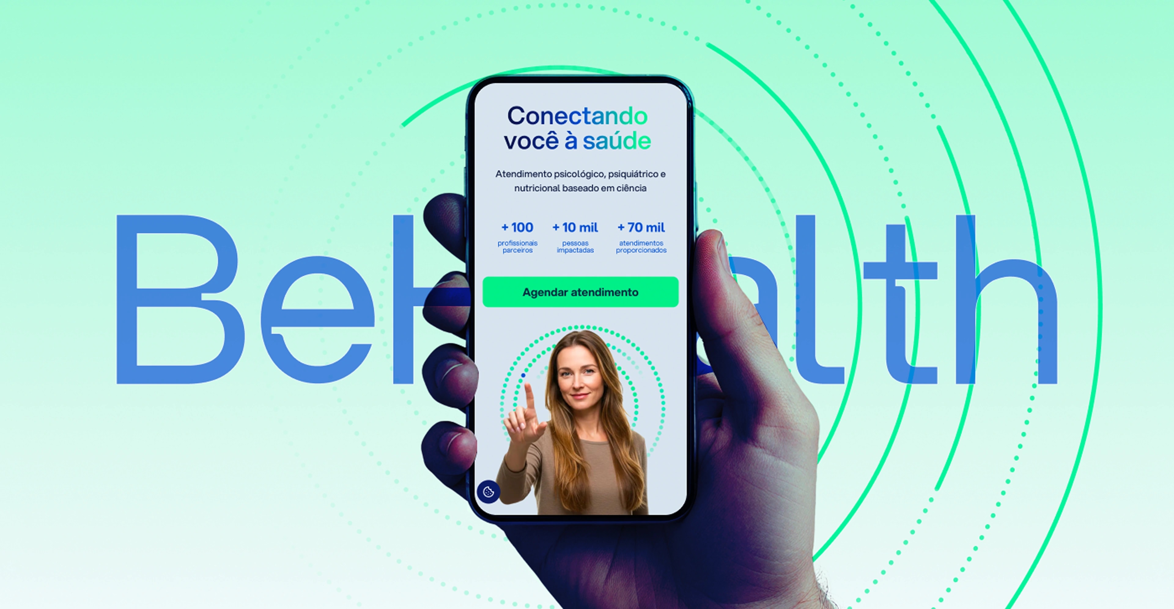
BeHealth is a health hub with more than 70,000 appointments delivered. Founded in 2022 by partners Eslen Delanogare and João Perini, it now counts two more partners: Juliana Fonseca and José Siqueira. It brings together a team of science-led professionals with deep experience in Psychology, Psychiatry, Nutrition and Endocrinology, ready to care for the physical and mental health of the thousands of patients who have come through the hub.
Challenge//
Solution
We have worked on the project since its founding in 2022, back when it was still a clinic. In 2024, with new partners coming on board, a new challenge appeared: turning the clinic into an interdisciplinary health space.
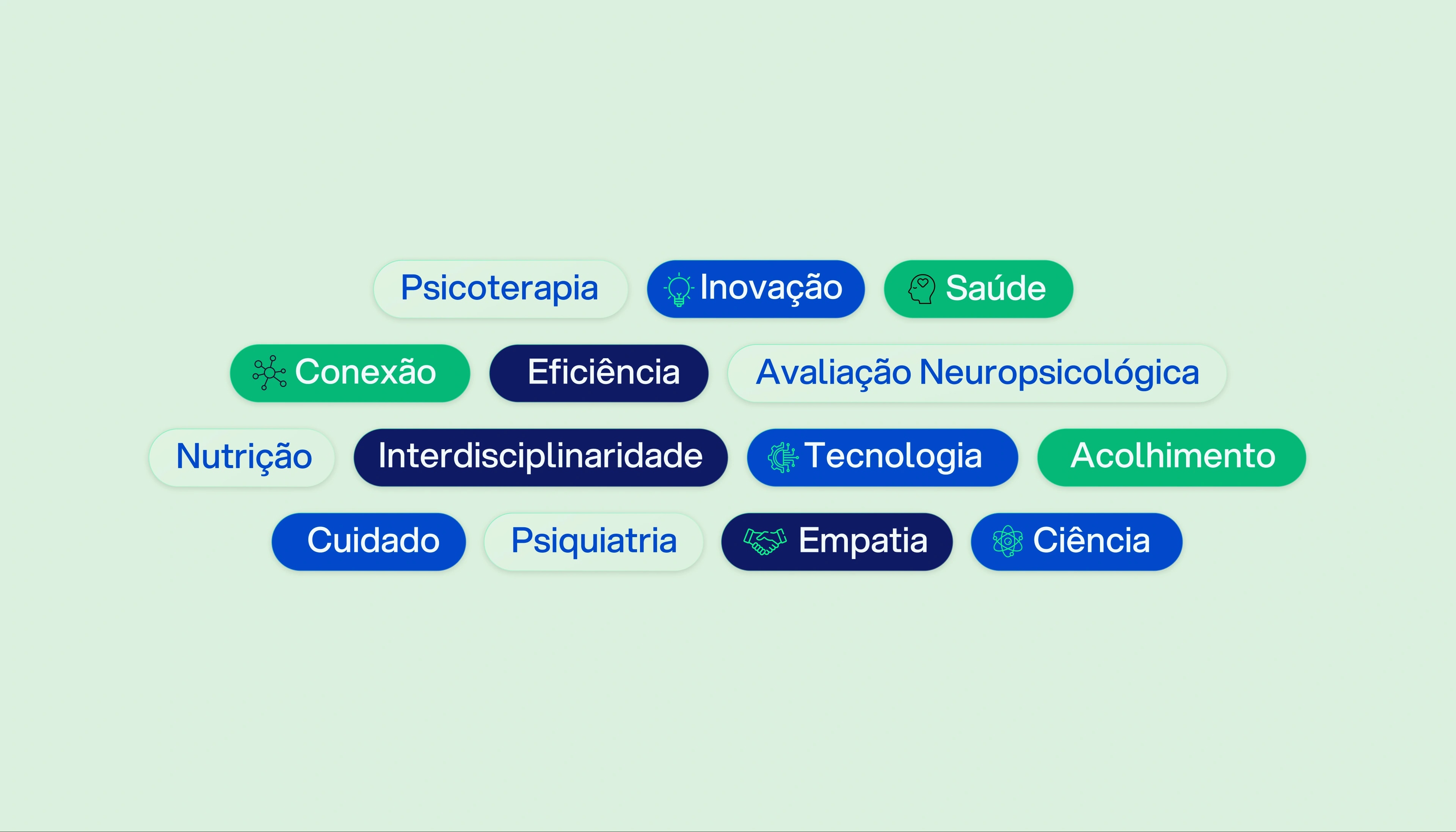
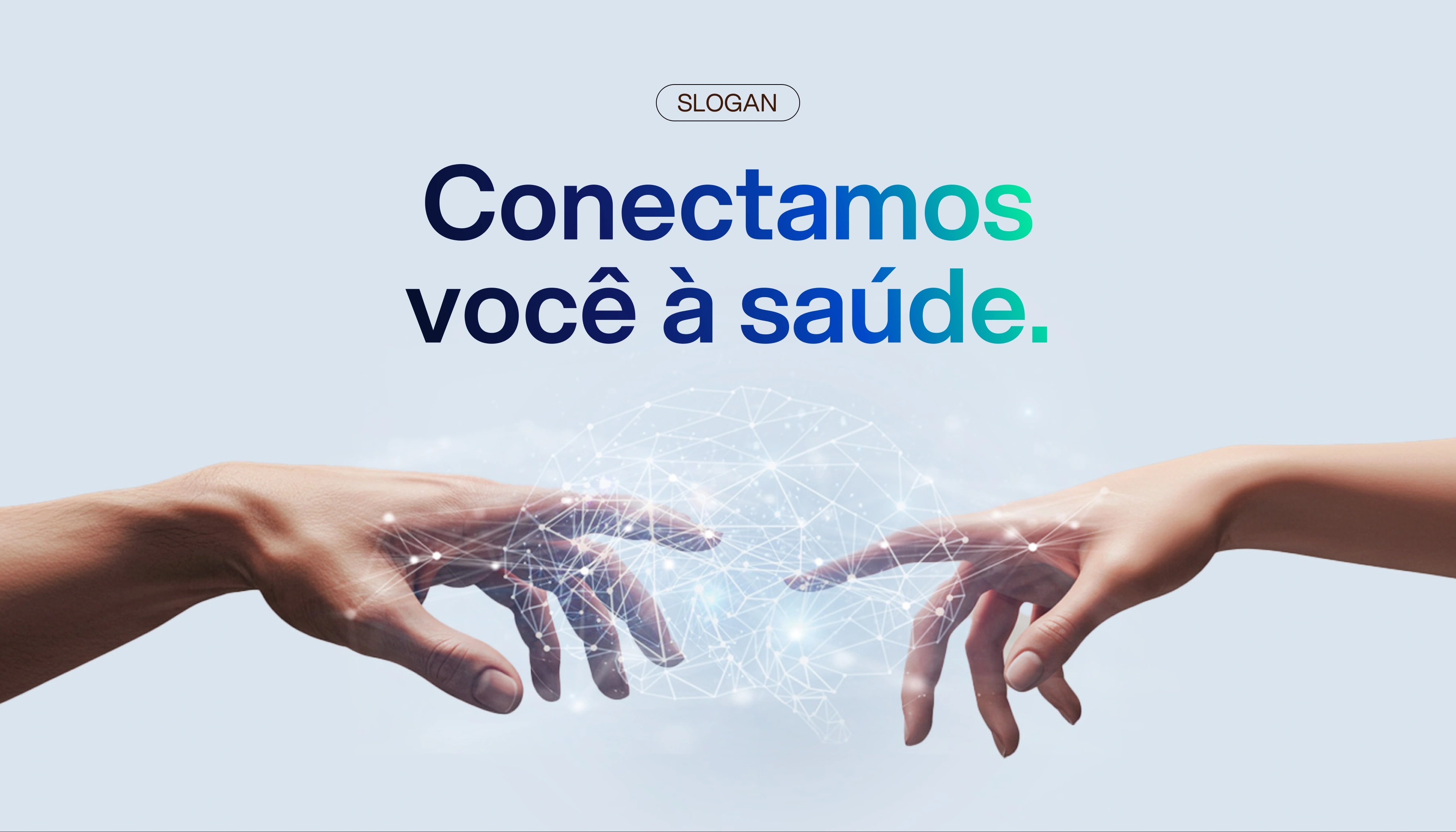
Through interviews and a brand workshop we arrived at the strategy: turn BeHealth into a Health Hub that connects people to an exclusive network of specialists, combining advanced technology with a humanised, science-based approach.
Brand
manifesto
When we need someone, we call. When we need help, we ask.
We want someone to take our hand and guide us. To lead us out of where we are and into wellbeing.
To connect us… To who we love, To who we seek, To who we need.
When you ask for help, BeHealth connects you.
Connects to health professionals who work from science. Partners who use the best evidence, with the highest expertise, personalised to what you need.
Professionals who respect you, your time, your problems, and who take you where you want to be. BeHealth always looks to the future and shows you and its partners that there is always room to improve.
A company focused on lasting connections, joining humanity, excellence and technology — bringing you care and giving the professional excellence.
An ongoing commitment to health, to Evidence-Based Practice, to partner professionals and to you. Always.
BeHealth, connecting you to health.
Visual
identity
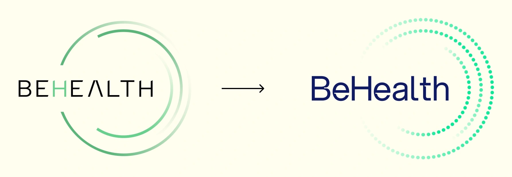
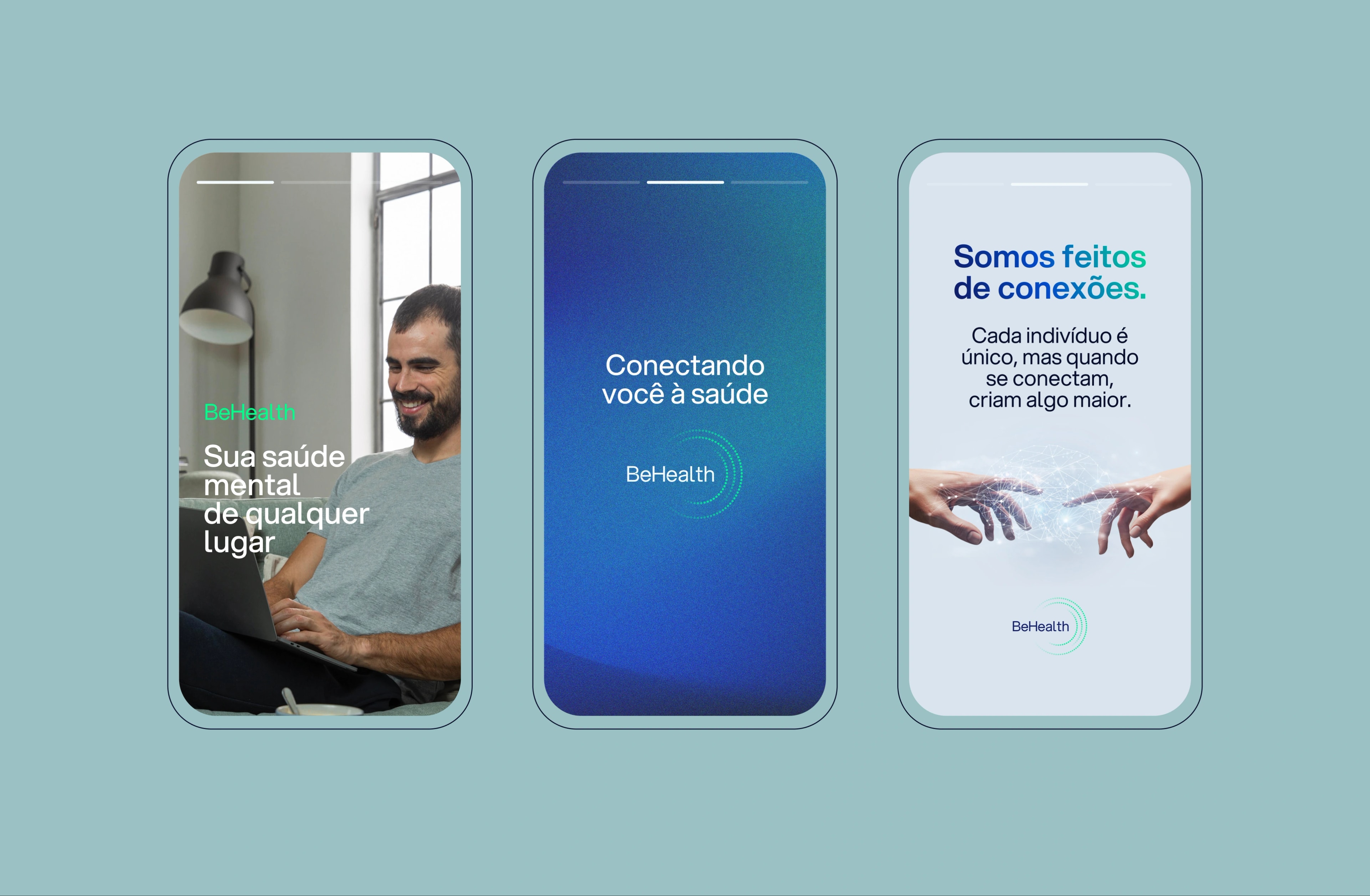
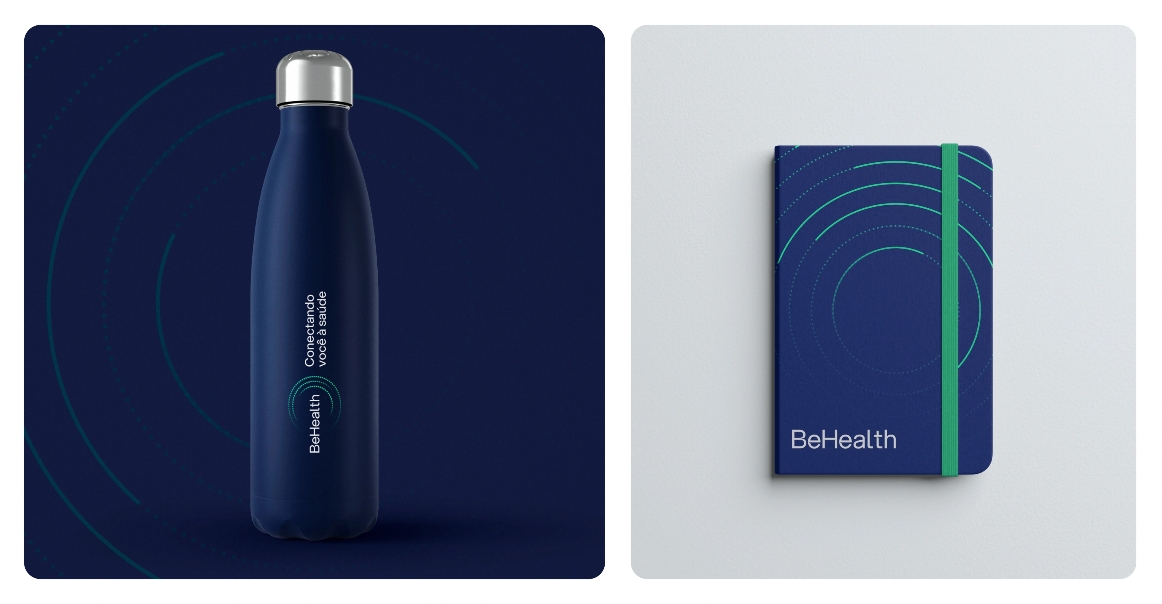
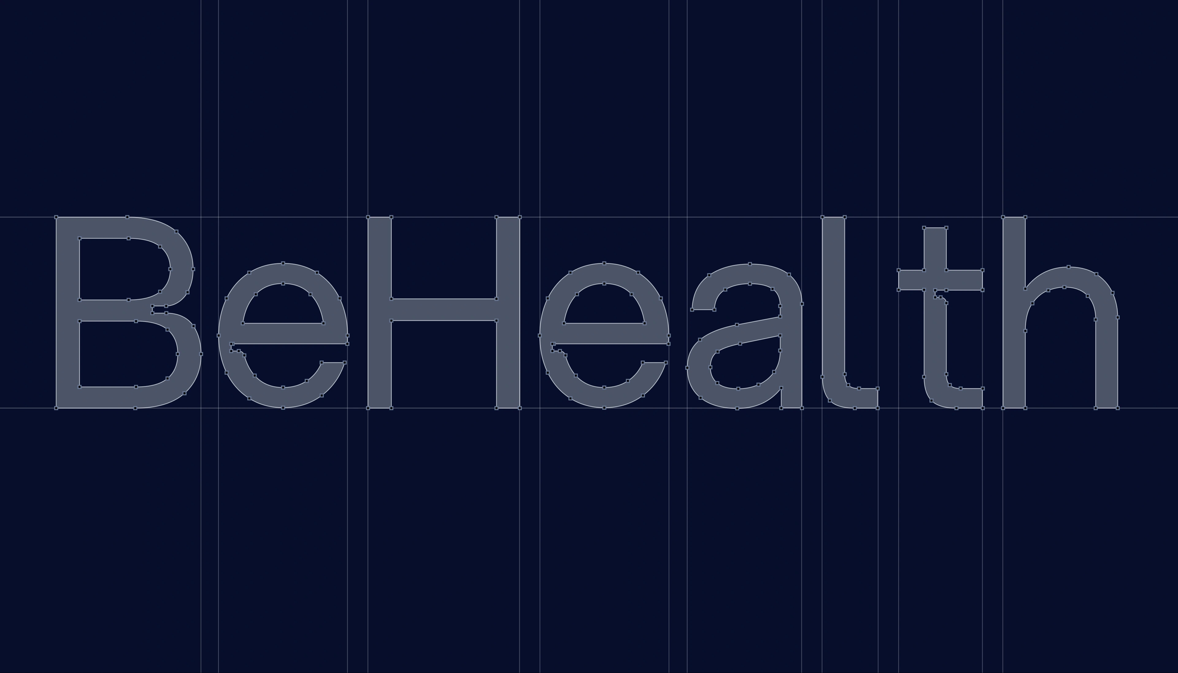
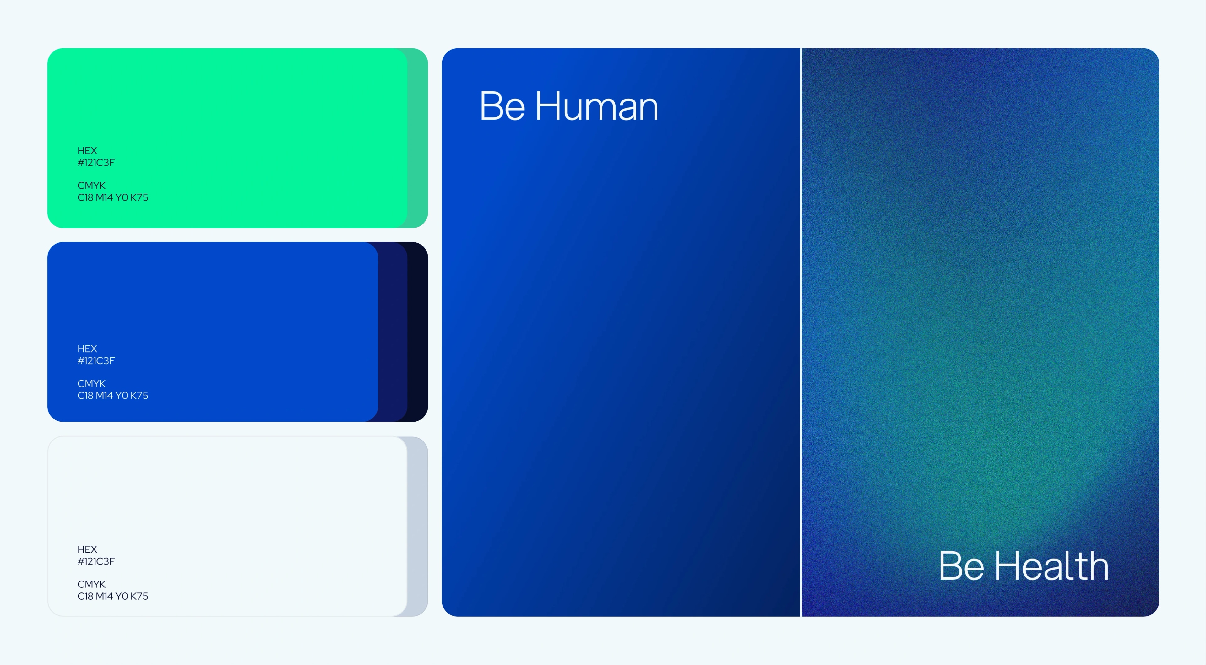
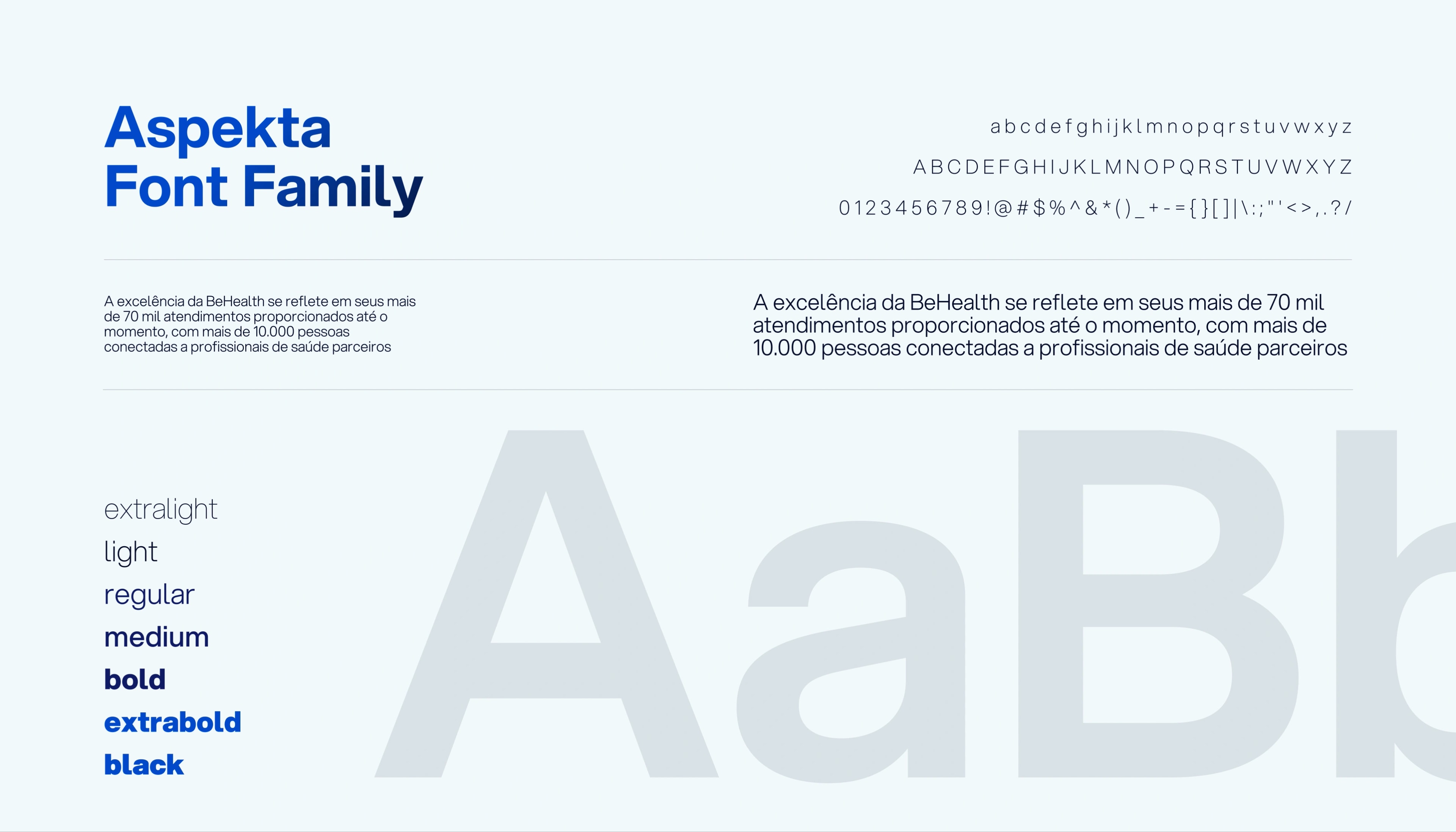
We kept the visual essence of the brand. The idea was never to erase what had been built, but to refine it to fit the brand's new moment. We expanded the colour palette to bring in the innovation arm. We kept the original logo, but with targeted changes. The name stopped being all-caps, we made the typeface more human, giving weight to the "Be", and instead of solid-filled circles we dotted it to show it is a hub made of people who connect people.